ItaWiki
Role
UX/UI Designer - Web designer
Year
2024
ItaWiki is an educational platform designed for IT Academy, focused on making programming resources more accessible. The project aimed to create a simple and organized space that connects students and mentors, encouraging collaboration and supporting the learning journey with clear and reliable study materials.

1 | Discovery
Problem
Students at IT Academy faced challenges in managing and accessing study resources. Since the bootcamp was self paced, materials were often shared in scattered conversations on platforms like Discord, making it difficult to keep track of valuable information. This lack of organization slowed down the learning process and created frustration for both students and mentors.
Initial Approach
The first proposed solution was to design a centralized platform similar to Moodle, where all learning resources could be stored and organized in one place. The idea was to provide a structured library that made navigation easier for students and mentors, reducing time spent searching and creating a foundation for more effective collaboration.
Objectives
*Create a centralized and intuitive platform for programming resources.
*Reduce the time students spend searching for study materials.
*Provide mentors with clearer ways to guide learning.
*Foster collaboration and community engagement.
Deliverables
Research and discovery
User personas
Journey maps
Wireframes
Mockups
UI design system
Responsive prototypes
Tools
Figma
GitHub
Taiga
Css
HTML
Benchmarking
To guide the design of ItaWiki, we analyzed existing educational platforms such as Moodle, Notion, and other collaborative learning tools. The review focused on how these platforms organized study materials, supported collaboration between students and mentors, and provided search and filter functionalities. From this analysis, we identified effective patterns like intuitive navigation and resource categorization as well as pain points, such as overwhelming interfaces and limited personalization. These findings helped us define a clearer, more accessible structure for ItaWiki, tailored to the needs of bootcamp students.

2 | Definition
User persona
From our research we defined four main user groups who would interact with ItaWiki.
It Academy students → Programming students at IT Academy who need a centralized place to access reliable learning resources. Their goals are to save time searching, keep track of materials, and collaborate with peers.
"I waste too much time looking for the right resources when I should be coding."

Hector
Age: 28
Location: Barcelona
Occupation: Front-end developer student

"I want to help students, but I end up repeating the same explanations and sharing the same links."
Mentors → Professionals guiding students during the bootcamp. They need a way to share curated resources, recommend content, and ensure students follow a clearer learning path.
Lucia
Age: 34
Location: Barcelona
Occupation: Fullstack developer mentor
Administrators → Internal staff from IT Academy responsible for keeping the platform organized. Their role is to maintain categories, manage contributions, and make sure the system runs smoothly.
"It’s hard to know if students are really using the materials the way we expect."

Marc
Age: 37
Location: Barcelona
Occupation: Staff coordinator
Guest users → Visitors without an account who can browse and view the resources. Unlike students and mentors, they cannot contribute new content but still benefit from accessing curated information.
"I like browsing the materials, but I wish I could contribute too."

Ignacio
Age: 30
Location: Bogotá
Occupation: Data student from an online bootcamp
The analysis of the different profiles allowed us to map the journeys of each user within the platform. IT Academy students begin by searching for resources to complete their sprints, finding value in centralization but often frustrated by scattered links. Mentors aim to guide students but face repeated questions and disorganized information. Administrators approach the platform from a quality control perspective, needing updated and consistent resources but lacking visibility into actual usage. Guest users arrive out of curiosity but their journey ends quickly due to limited access.
Across these journeys we identified common friction points, such as disorganized resources and wasted time, as well as opportunities to improve the experience through centralization, accessibility, and collaboration.
User journey map

3 | Wireframes
One of the first key decisions was to establish which subjects would be the core focus of the platform. By doing so, we ensured that the initial navigation reflected the areas with the highest demand and relevance for our target audience, rather than overwhelming users with all possible categories from the start.
In parallel, we designed the structure of the main pages to highlight these priorities: quick access to core subjects, streamlined paths to upload and manage resources, and a clear separation between public content (available to users without an account) and private areas (for students and professors). The wireframes at this stage were not about aesthetics, but about aligning functionality with user goals.

The decision to centralize ‘upload materials’ in the main navigation came directly from professors’ stories, where efficiency and repetition were critical. Collaborative features like voting and resource sharing were included to foster peer to peer interaction and, importantly, to help students prioritize truly valuable resources over basic or less effective ones. This approach shortens search time and prevents wasting hours on content that doesn’t add real learning value.
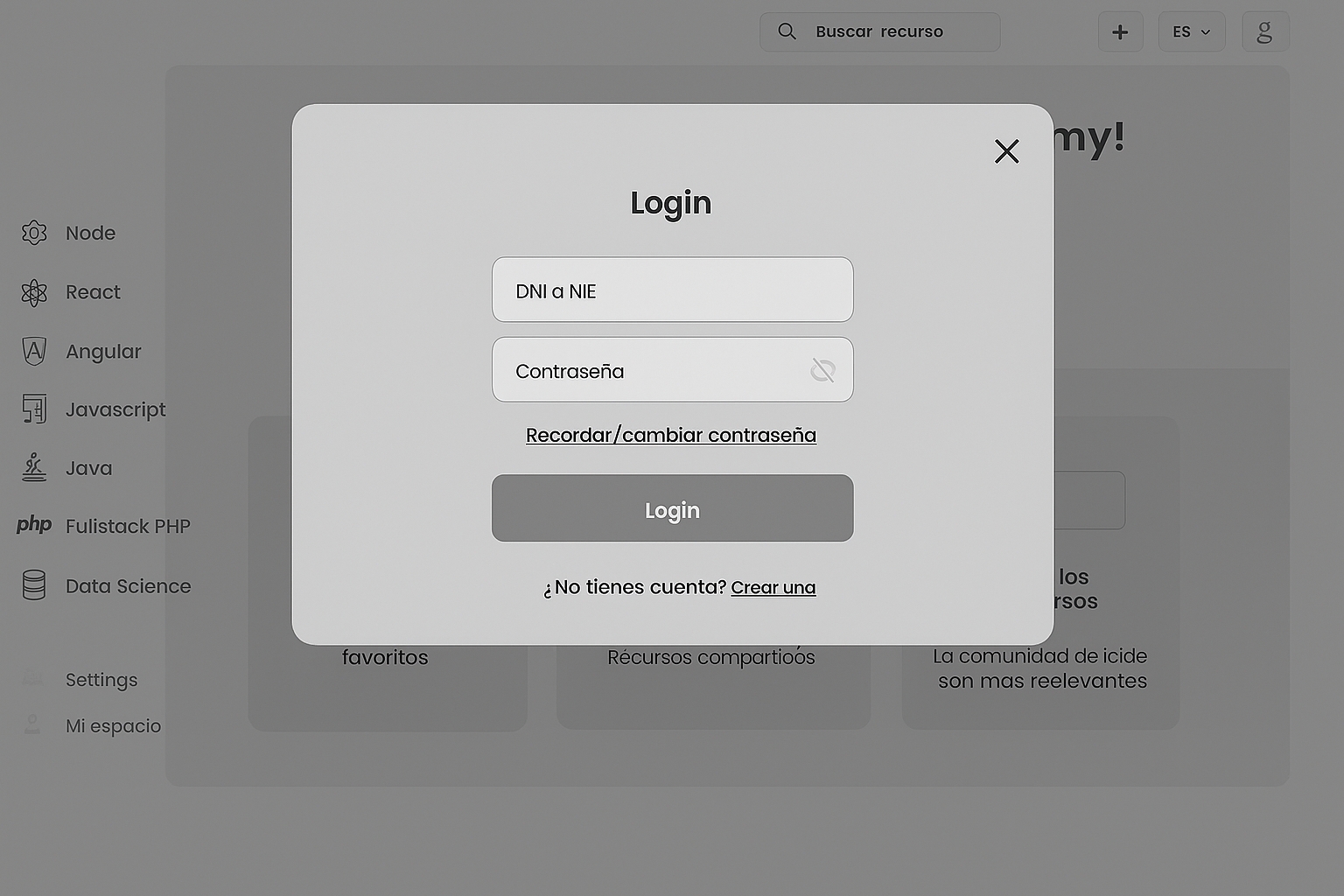
To simplify the flow, we decided that certain actions, such as uploading a new resource should not take the user out of the main page. Instead, they appear as lightweight popups with a simple structure, allowing users to complete tasks quickly without breaking their navigation or context.
4| Mockups
The interface was kept clean and minimal, ensuring that students and mentors could focus on finding and sharing resources without distractions.
The mockups included key pages such as the homepage with an overview of the platform, the resource library with filters and categories, and the favorites section for quick access to personal study materials. Each design choice was guided by the goal of making the platform intuitive and supportive of collaborative learning.


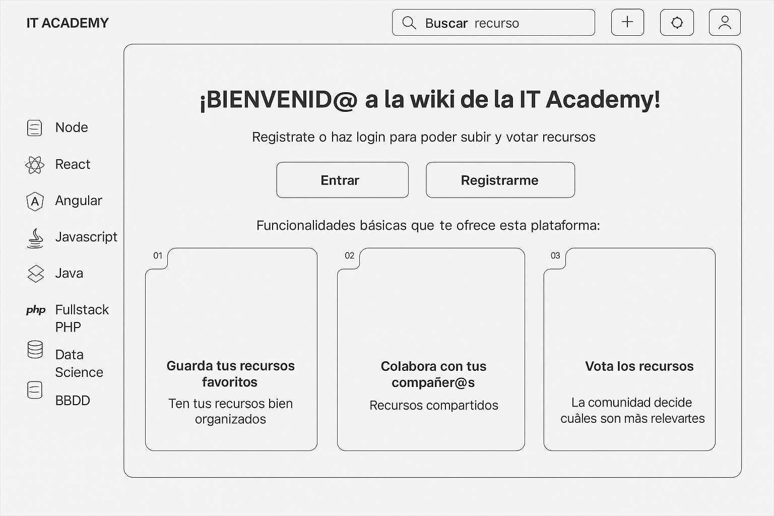
The welcome screen was designed with the user’s first interaction in mind. Since this is the entry point to the platform, the priority was to communicate clarity, trust, and ease of use. We used a grayscale palette as the foundation to keep the interface clean and distraction free, while integrating the brand’s magenta accent color to highlight the most important actions. This ensures users are visually guided towards registering or logging in, which are the key steps to start engaging with the platform.
From a user perspective, the sidebar immediately displays the main subjects; Node, React, Angular, Javascript, Java, PHP, Data Science, and Databases. This helps users quickly identify the areas most relevant to them and reinforces the platform’s focus. In the central section, the welcome message is paired with clear calls to action and simple feature cards that explain what users can expect once they join: saving resources, collaborating with peers, and voting on content.


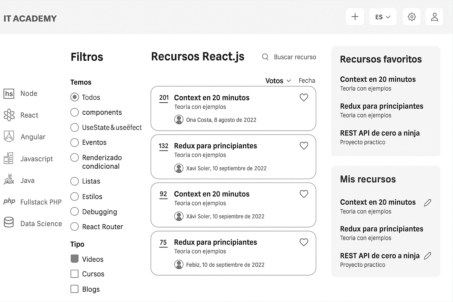
In the resources view, a key decision was to integrate a favorites feature. During research, students expressed the need to revisit the same materials multiple times, especially when preparing for tasks or revising specific topics. By allowing users to mark resources as favorites, the platform creates a personal section where these items can be easily found without repeating searches.
This decision makes navigation smoother and reduces cognitive load, since users don’t have to scan through long lists every time they return. Placing “Favorite resources” in a dedicated panel on the right side ensures quick access while keeping the main list focused on exploration and discovery. Together with the filtering system, this approach strikes a balance between browsing a wide catalog and maintaining a personalized space for each user.
5 | Impact and conclusion
One of the main pain points identified during research was that students often struggled to quickly find the right material, spending too much time searching instead of studying. To address this, the design followed a minimalist approach, reducing unnecessary scrolling and prioritizing efficient navigation. Filters and favorites were integrated to allow users to narrow down results and save key resources, making content retrieval faster and smoother. By focusing on this problem, the platform ensures that students can easily locate what they need, ultimately improving their learning experience and reducing frustration.
Students and mentors engaged more actively by sharing and curating resources in one centralized space, reducing duplicated efforts and increasing teamwork efficiency.
With resources organized and easy to find, students spent less time searching and more time practicing, which helped them progress faster through bootcamp milestones.
A structured library with filters and categories ensured that all users, including guest visitors, could easily locate relevant content at any time.
By enabling contributions from both students and mentors, the platform fostered a stronger sense of belonging and collaboration across the IT Academy community.